Linardics Kft.
Thirty years of expertise, five technologies, eighteen CNC machines — a three-language site that turns all of it into quote requests.
linardics.hu →Linardics Kft. has been making precision sheet metal parts in the Sóstó Industrial Park in Székesfehérvár since 1994 — the expertise was there, it just was not visible. And in B2B sheet metal work the slogan decides nothing: buyers want to know what machines are on the shop floor, how large a sheet can be cut, what tolerances are held, and whether there is an ISO 9001 behind it. If they cannot find that within five minutes, they move on to the next supplier — so the site had to answer those questions, not tell a company history.
Then came language. A significant share of orders comes from Austria and Germany, so the site had to be equally precise in Hungarian, English and German — from the technical vocabulary to the downloadable certificates and the signals sent to search engines.
The third difficulty was sheer volume: five technology groups, fifteen services, eighteen CNC machines and a knowledge base that keeps growing. All of it had to be organised so that a visitor reaches their own job in two clicks.
A 2014 WordPress build that no longer spoke to the buyer.
The client said three things, in this order: the site looks dated, no enquiries come through it, and publishing new content is hard. Those three complaints turned out to point at three different layers — the brand, the information architecture, and the editing surface.
The previous site launched in 2014 on WordPress, built on the plugin stack of the day: WPML for languages, Contact Form 7 for enquiries, fancybox for galleries. A stock illustration in the hero, sidebar menus and running text on the service pages, and a machinery page that was a sixteen-row accordion — one name per machine, no photo, no technical data.
The measurable part showed up in two places: load speed, and what the site told search engines. Ten years of accumulated plugins made for a 7.8 MB home page and a 7.6-second LCP — while there was no structured data at all, so nothing told Google this was an ISO 9001 contract manufacturer in Székesfehérvár.
So the job was not a redesign but a reordering: everything needed for the decision — machine, parameter, certificate, quote request — had to come to the front.
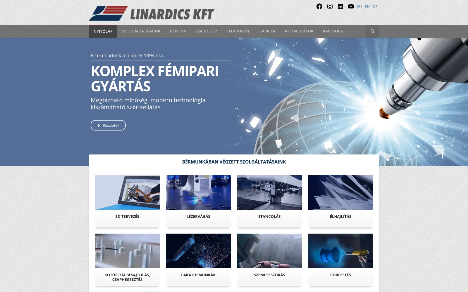
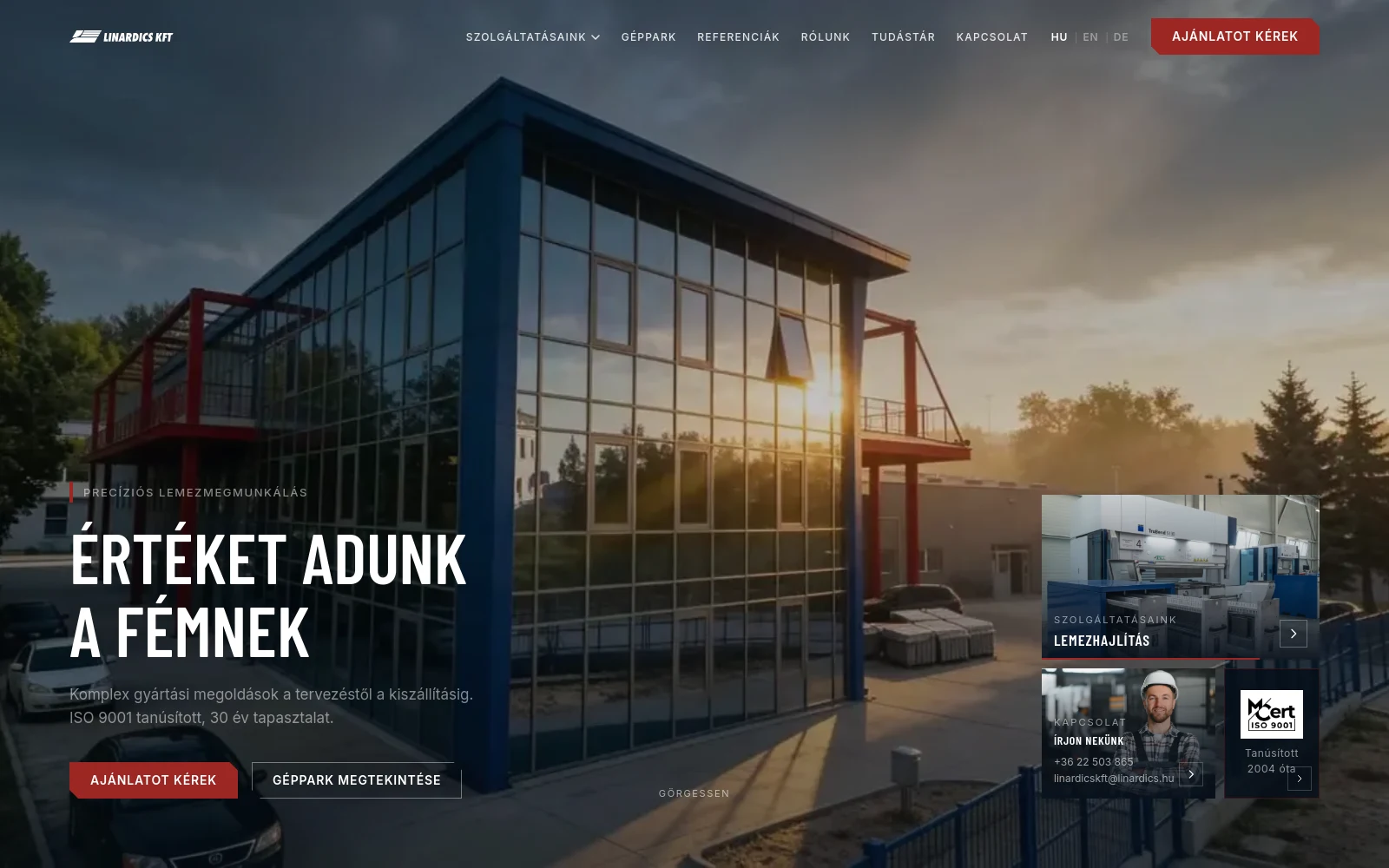
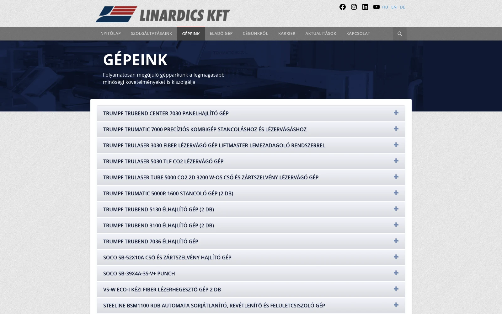
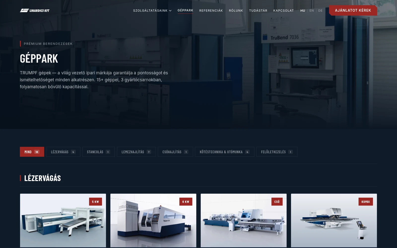
- Foundation
- WordPress theme + plugins React + Vite, own components
- Languages
- WPML plugin Per-language routes, hreflang, sitemap
- Machinery
- 16 machine names in an accordion 18 cards with photos and a filter
- Quote request
- Contact Form 7, one message box Three-step form with drawing upload
- Services
- Sidebar menu, running text 5 groups, 15 pages with parameters
- Structured data
- none Organization, WebSite, LocalBusiness
- Editing
- WordPress admin, cumbersome Own admin with a guide and an audit log
- Home page weight
- 7.8 MB 3.0 MB
- LCP
- 7.6 s 1.8 s
- Layout shift (CLS)
- 0.454 0.032
- Lighthouse (desktop)
- 8 · 79 · 96 · 85 99 · 95 · 96 · 100
The machinery as the argument
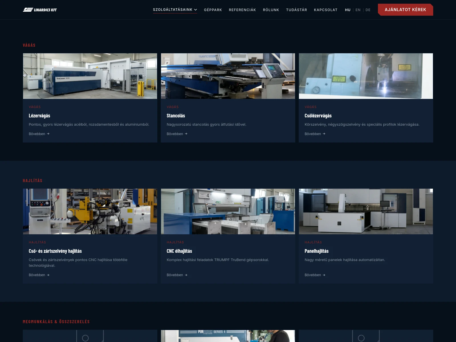
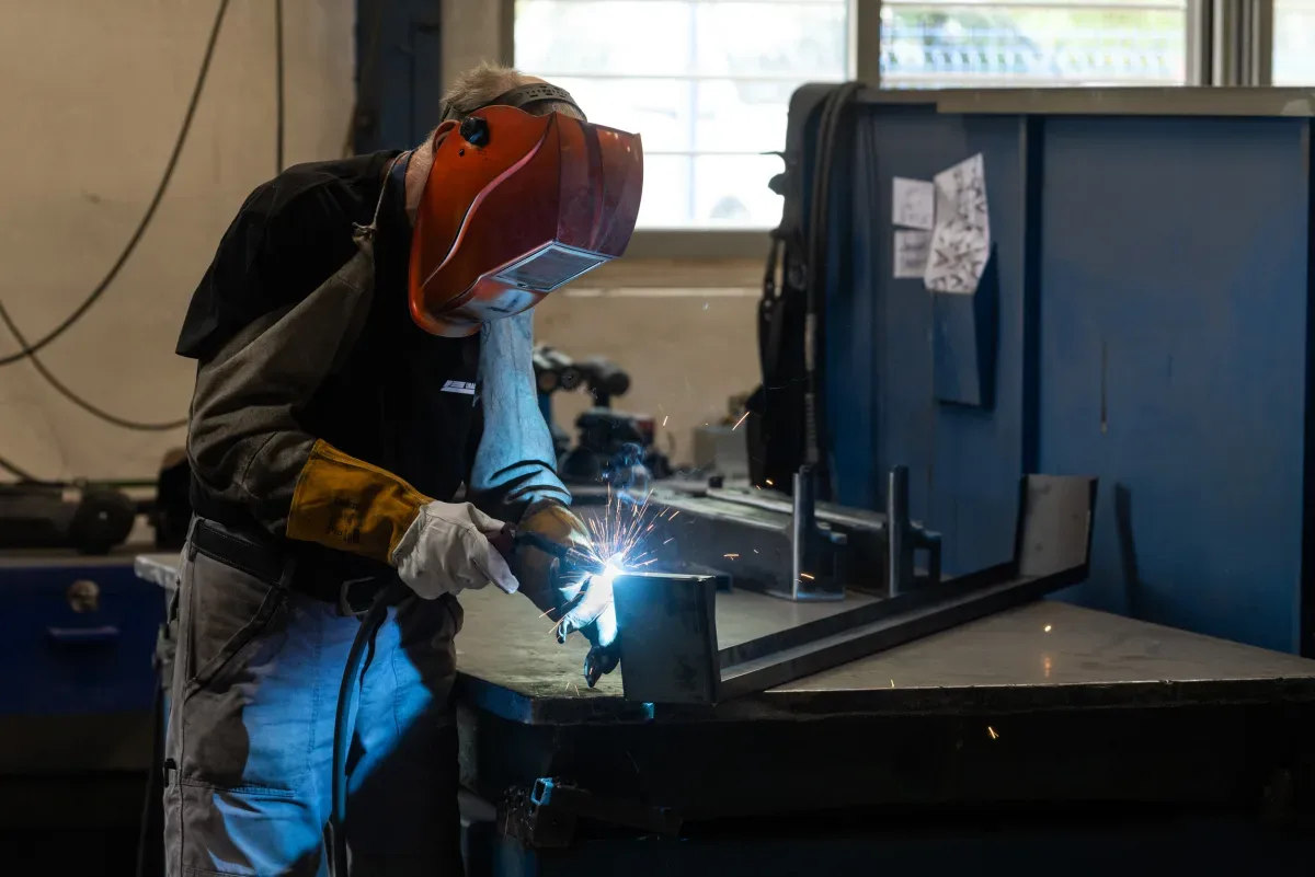
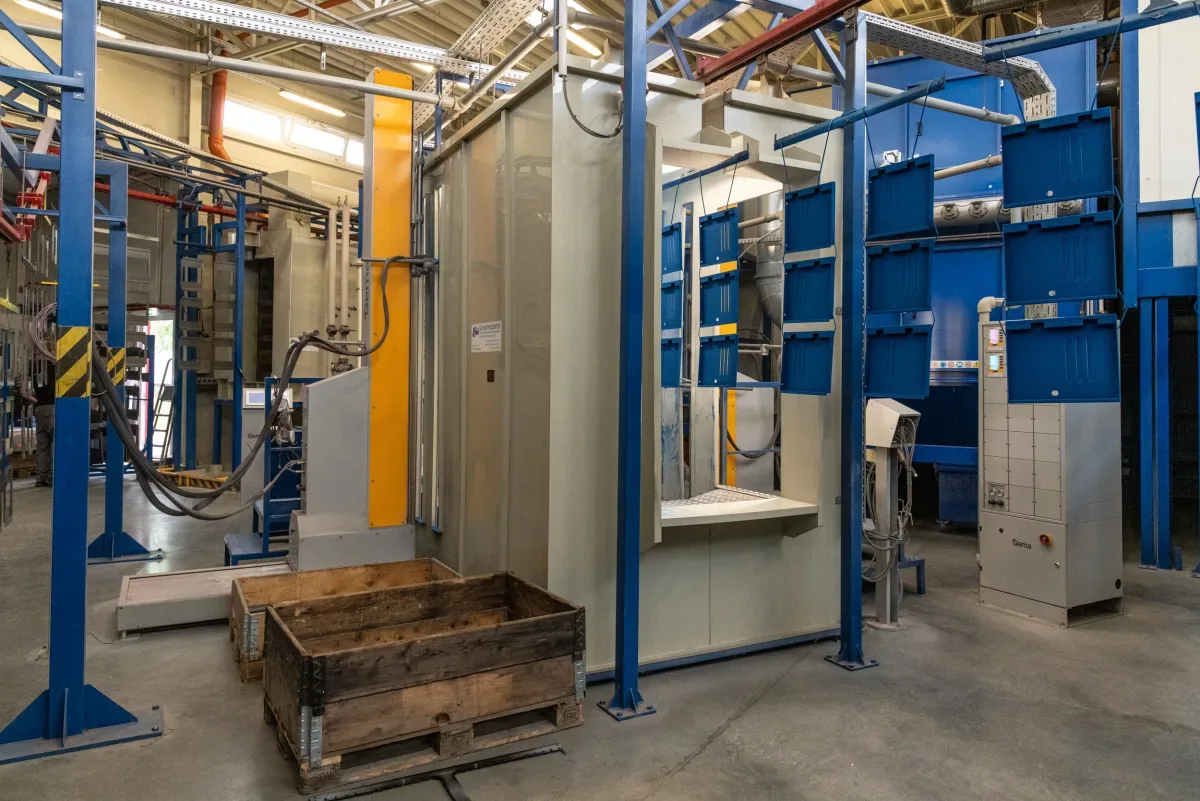
The structure follows the manufacturing process: cutting, bending, machining, surface treatment, logistics. Every group got its own service pages, carrying the parameters buyers look for — bed size, materials, maximum thickness, tolerance.
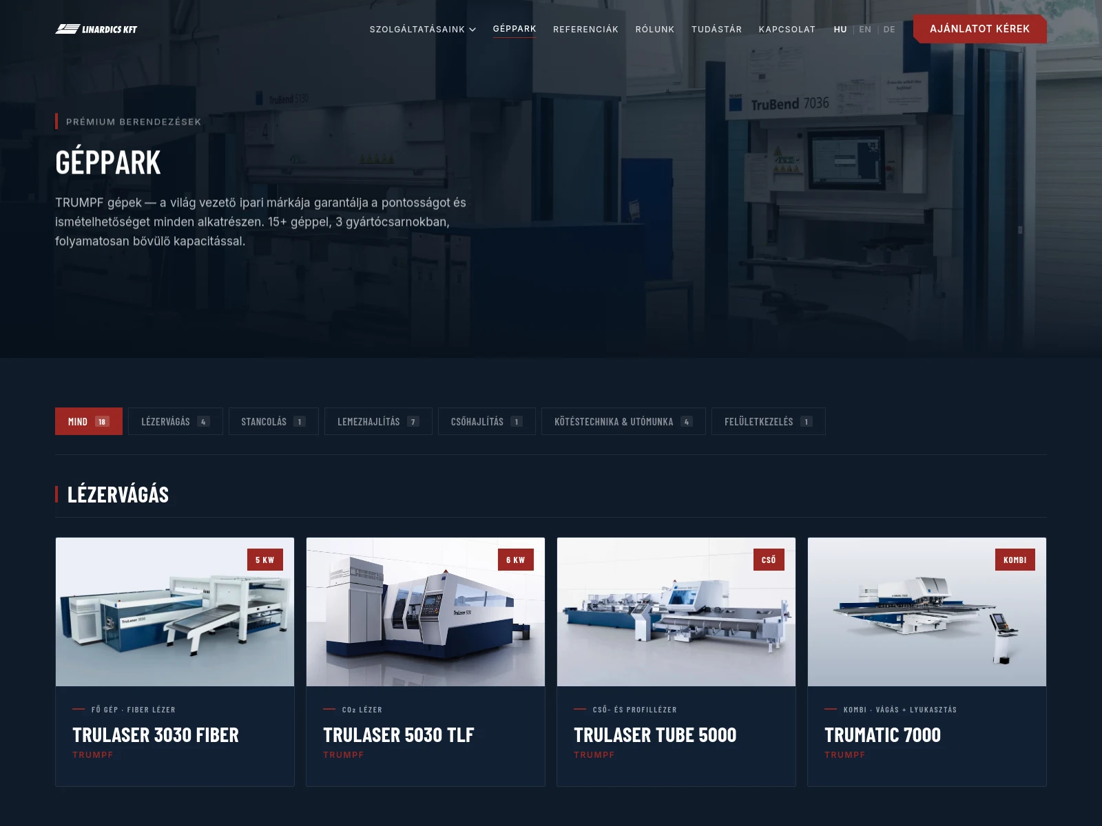
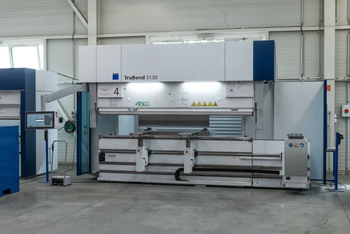
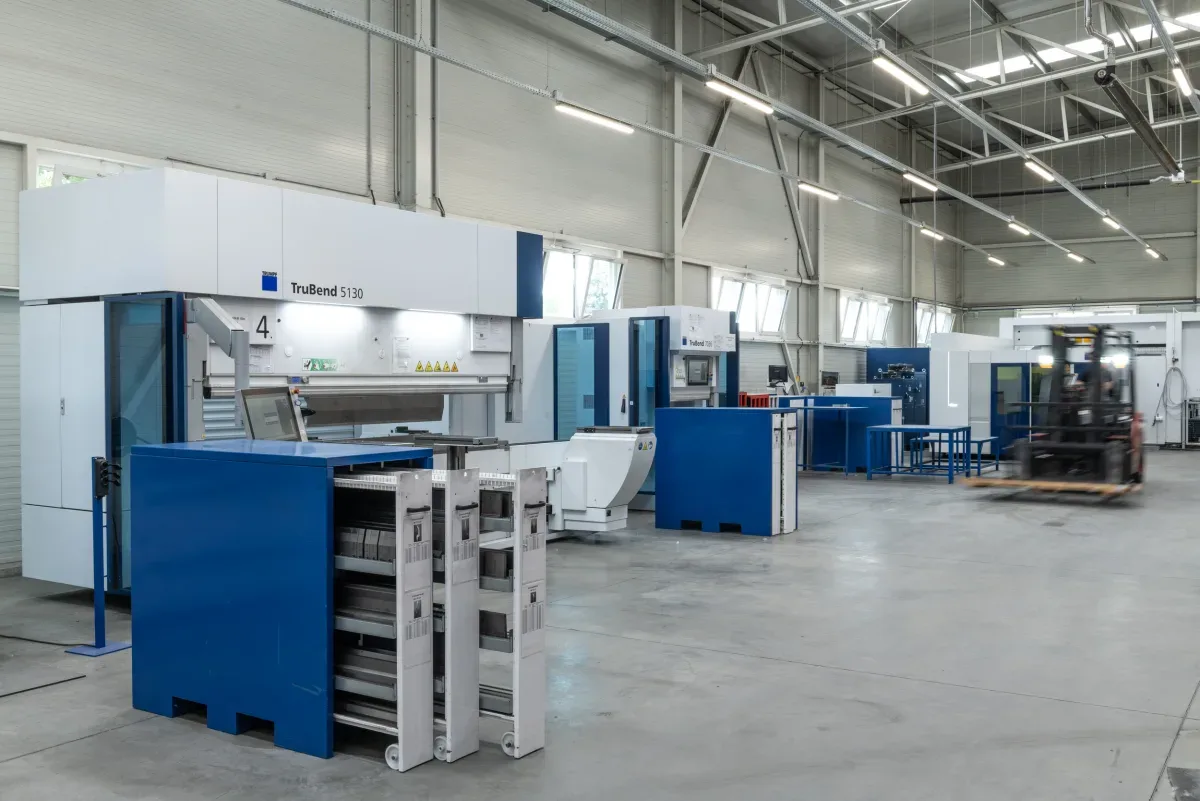
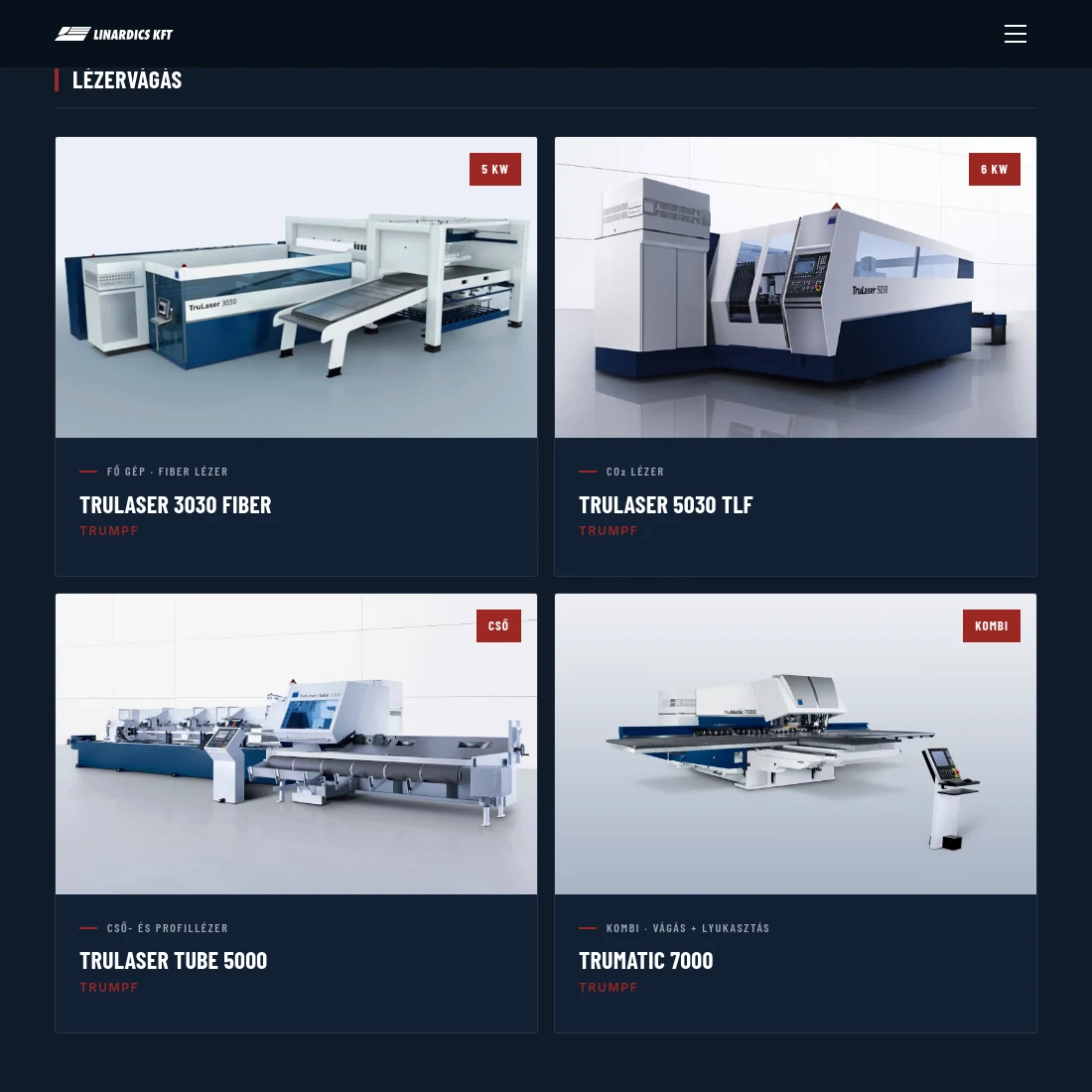
The machinery got a separate, filterable page: eighteen machines grouped by technology, each card showing the manufacturer and the one technical figure that matters. Next to it sits a knowledge base for organic traffic, and a three-step quote form that runs from contact details through project data to drawing upload.
None of this is visible to a visitor, but the backbone of the project is a custom admin: the machines, the knowledge base, the categories and the image library are all managed there, in all three languages — with a built-in, searchable guide for new staff.
Industrial dark, not "tech" dark.
We were given a brand manual, but it said very little about the web — the digital language was largely ours to shape. The dark palette was our proposal: a deep blue-black base that lets the machine photos come forward, and a single warm red accent that always means the same thing — something can be done here. We did not add a second accent colour: on a B2B site colour is for direction, not mood.
The red comes from the logo, but it is not exactly that shade. The original did not hold the contrast requirement on a dark background, so we retuned it for the web — a design and an accessibility decision at the same time.
Type splits into two roles. Barlow Condensed gives narrow, engineered uppercase headings — and that is not an aesthetic choice here: on a three-language site "Tube and hollow section laser cutting" simply does not fit one line in a normal-width face. Body copy is Inter; technical data and machine identifiers are JetBrains Mono.
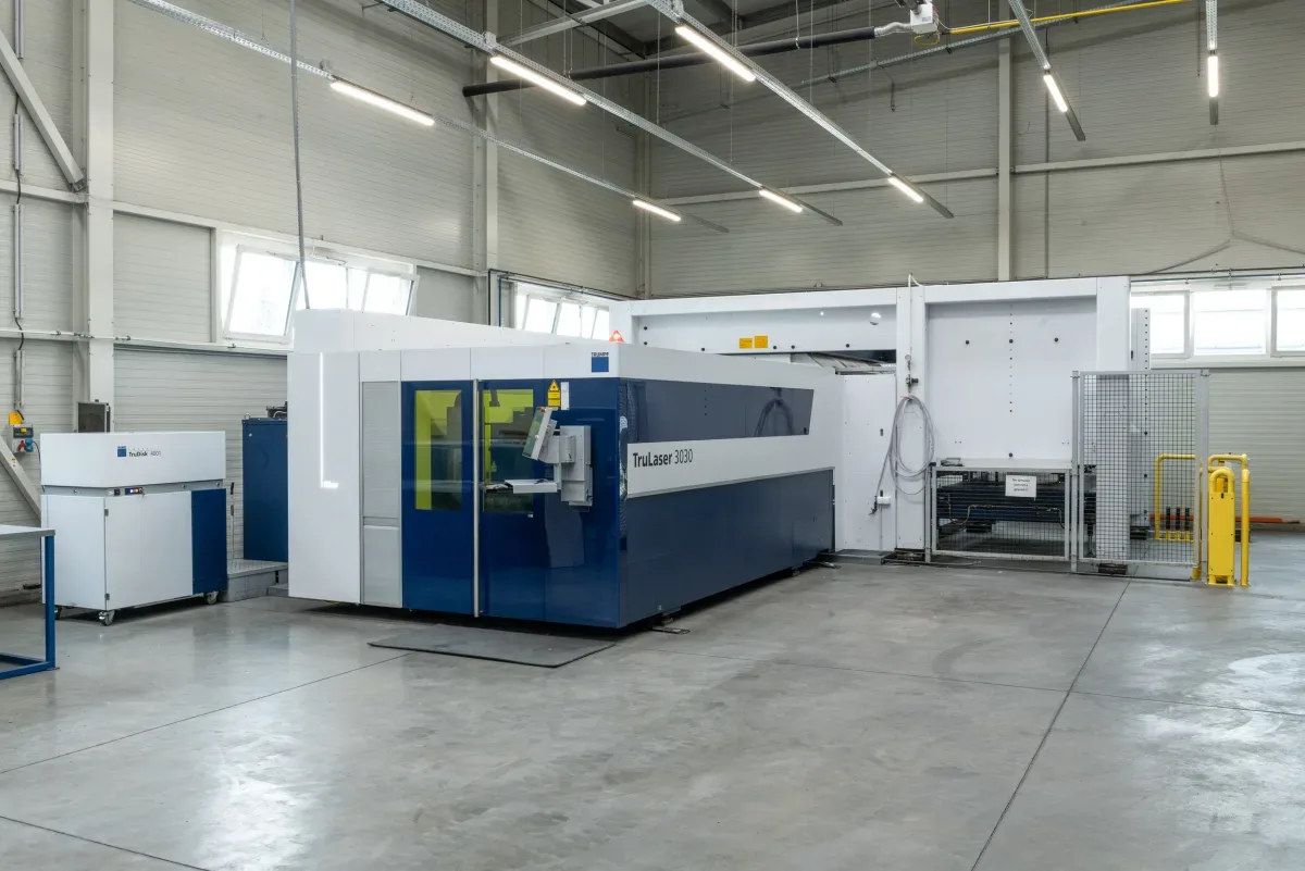
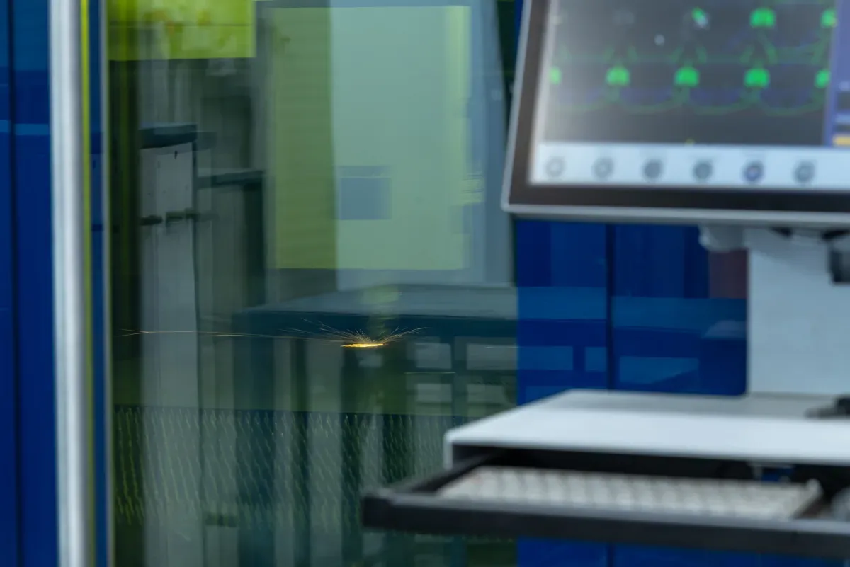
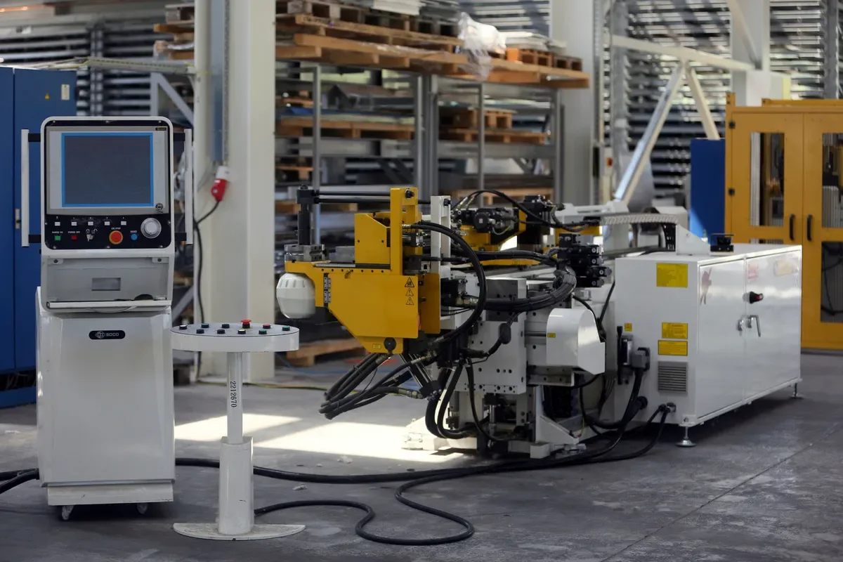
The photography does two different jobs. The catalogue shot — white background, consistent angle — is there so a buyer recognises the machine they are looking for at a glance. The on-site shot is there because it proves something: the machine really exists, it runs, and the shop floor around it is in order. At a contract manufacturer those two together answer a question nobody asks out loud.
Motion is GSAP-based and restrained: a scroll-triggered rise that never pulls attention away from the data.
Half of all industrial sites go dark because dark is in fashion. This one went dark because 90% of a machine photo is grey metal — on a light background they blur together, on a dark one they read. Colour is a tool here.
Bálint Kutassy client lead and spokesperson for the team, KUTASSY
- Base #060F1A Page background
- Card #0D1B2A Surfaces, list items
- Red #9C2622 Action and emphasis
- Navy #0F3052 Secondary surface
- Barlow Condensed Uppercase headings, navigation
- Inter Body copy, forms
- JetBrains Mono Technical data, machine identifiers
What we built, and what it was based on.
We did not start from a feature list but from the order in which a buyer asks questions. Every decision below carries its source.
-
01
The structure and the routing table were the hardest part.
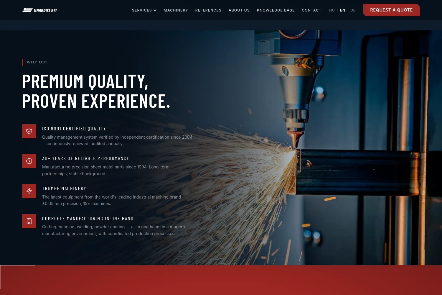
The site's base language is Hungarian, but the market is Austria and Germany. The routing table could not simply be "translated": one table has to feed the navigation, the mega menu, the language switcher, the hreflang and the sitemap, across all three languages. How to handle slugs per language was a separate question inside that — with a Hungarian base language it is not the same job as on an English-first site.
Based on: if the switcher and the hreflang build URLs from separate logic, any drift between them throws no error — it just leads to a 404, and you only find out when someone clicks.
-
02
Languages do not come from a plugin.
Three languages with per-language routes, hreflang and a sitemap generated at build time. The Organization / WebSite / LocalBusiness JSON-LD sits statically in the document head rather than being injected client-side.
Based on: in an SPA the client-side meta layer is not necessarily seen by the first, non-rendering crawl — a static head always is.
-
03
The machinery became a filterable database of its own.
Eighteen machines grouped by technology, each card carrying a photo, the manufacturer and the single figure the decision needs — power, tonnage, or the fact that it is a combi machine. The filter shows counts, so one glance tells you whether there is any tube bending capacity at all.
Based on: the old site had the same content as a sixteen-row accordion of names — no photo, no data, no filtering.
-
04
The quote form pre-qualifies; it does not just collect data.
The client interviews surfaced a sharp split. Large buyers send procurement emails so every supplier quotes on the same basis — a form will never catch them. Smaller, one-off customers do fill in forms, but rarely with everything needed to price the job. Every one of those leads means a call and a conversation — a lot of man-hours before anyone even knows whether it is worth it.
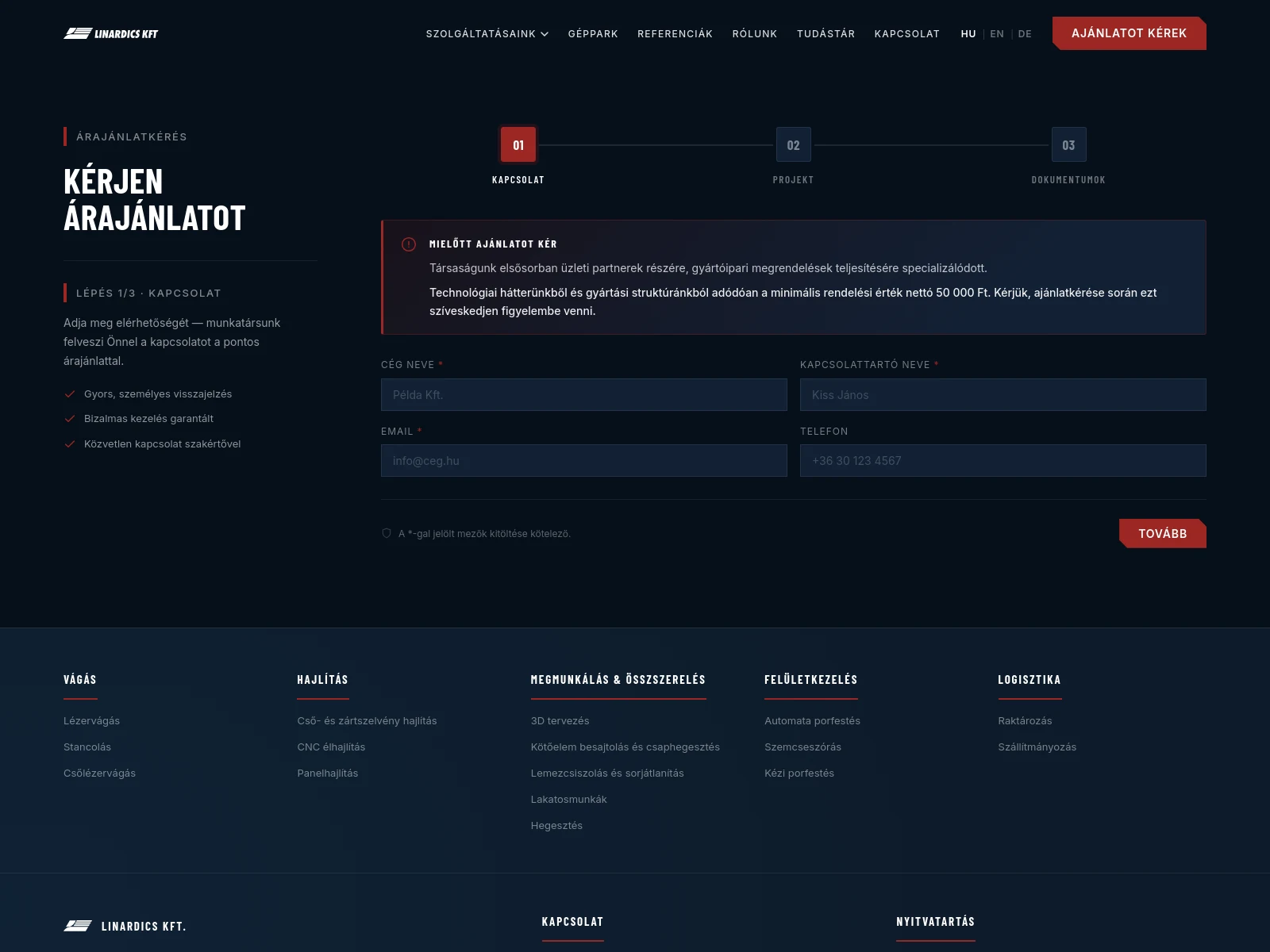
Based on: this is why the form states a net HUF 50,000 minimum before you start and asks for project data up front — it is not screening the customer, it is protecting the manufacturer's time.
-
05
Three steps, because of the bounce rate.
Step one asks only for contact details, step two for project data, step three for the drawing upload. Put on one screen, the sheer number of fields needed for qualification would scare off even the people who would otherwise complete it.
Based on: with a long single-page B2B form, completion is decided on the first screen.
-
06
The real product turned out to be the internal admin.
Content and user management for machines, articles, categories and images, in all three languages, and — worth the most of all — a built-in guide for new staff. One of the original complaints was that publishing new content was hard; you cannot fix that with a nicer editor field, only by having the system teach the person using it.
Based on: over a site's lifetime people write into it far more often than anyone plans for.
-
07
The dashboard is a to-do list, not a statistics wall.
What greets an editor after login is not a set of charts but a "What do you need to do now?" list: a red bar for a draft waiting to be published, amber for a missing English or German translation and for a missing cover image, grey for an empty category. The button beside each row does not open the section, it jumps to the specific field and highlights it in red. With nothing outstanding you get a green "All good!" and, below it, suggestions that are not urgent — that an article has not been touched in six months, for instance.
Based on: an editor does not want to know how much content is in the system, they want to know what is missing from it. The counts are still there, they are just not the headline.
-
08
The admin explains its own consequences.
Under almost every field sits a line saying where the value shows up: "This is what appears in the listing on the public machinery page", "4:3 or wider recommended, min. 1200 px". At the top of the machine list one sentence settles the rule that matters most: only machines marked "Published" appear on the public page. Even the figure shown on the card — 5 kW, combi — is not free text buried in a description but a field of its own: "Highlighted value, shown as a red badge on the card".
Based on: a new editor is not afraid of failing to fill a field in, they are afraid of breaking something on the public site. If the interface says what a field does, the question never gets asked.
-
09
The system will not let an editor lock themselves out.
The audit log records every administrative action — logins, creation, deletion, reordering, password changes — and for edits it shows, field by field, what the value was before and what it is now. The log is deliberately not deletable. Alongside it come a few built-in constraints: some admin accounts are "protected" and cannot be deleted, with at least one always required to stay active; and the knowledge base allows exactly one featured article — mark another and the system unmarks the old one, but it will let you neither unmark nor delete the last one.
Based on: these cases come up once a year, and when they do they cannot be resolved without a developer. Writing them down as rules is cheaper than recovering from one of them once.
-
10
The "Machines for sale" page runs on the same machine data.
The technical data is already in the system, so advertising used equipment does not mean entering new content: the same data gets a second, sales-side view. A salesperson sends a link rather than copying a specification into an email.
Based on: the same data serving two business processes — so the second page is not new content, it is a new view.
-
11
We took the translation agency out of the process.
Turnaround would have been too long, and we could not find an agency we fully trusted — in the shadow of AI-generated text, the word "translation" is no longer a guarantee on its own. Instead we worked with AI translation models, and then the client's own salespeople working in each language corrected the mistakes. We exported the translatable content into separate, readable files so they would not have to edit in a developer format.
Based on: technical accuracy does not come from the translator, it comes from the person who sells the product in that language. We shaped the process around that.
-
12
We did not switch the old site off, we moved it.
The machine specifications came across from the old site, and the previous URLs 301 to their new equivalents. Over ten years a site like this accumulates links and rankings — throwing that away is a loss you get nothing for.
Based on: the domain's ten-year history was one of the project's most valuable assets, not its baggage.
-
13
The knowledge base is a search surface, not a blog.
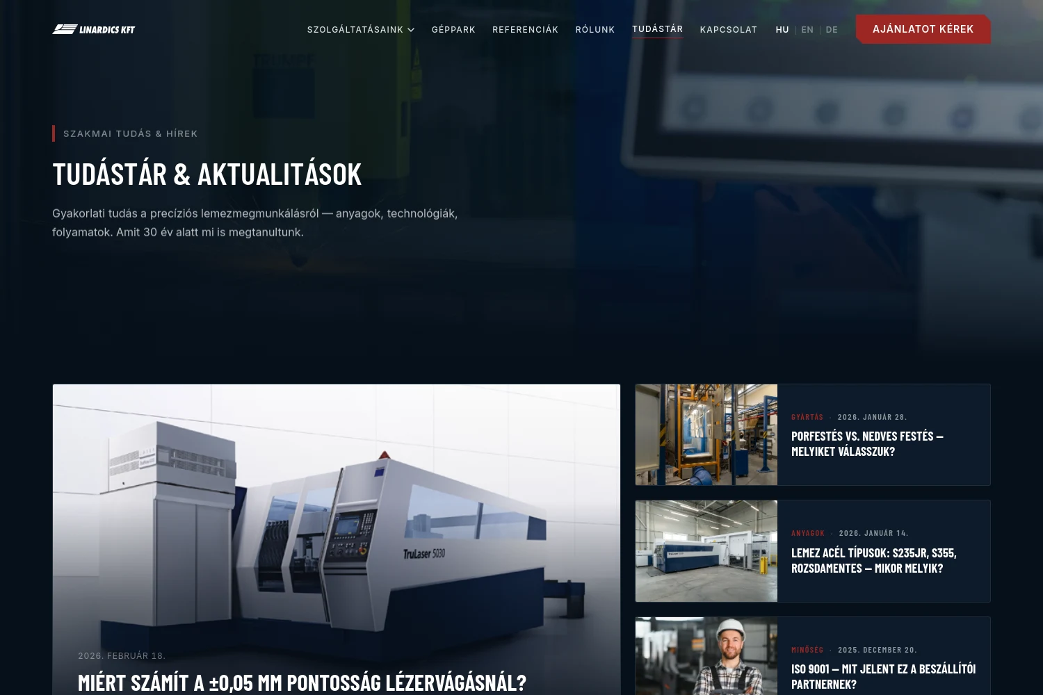
Material guides and technology comparisons — "powder coating vs. wet paint", steel grades — which is exactly what a buyer types into a search box before deciding.
Based on: service pages catch the search for a named technology; the knowledge base catches the search for a problem.
-
14
Speed is a design decision here.
A Vite build with code splitting along React / React Router / GSAP, a preloaded hero image, and only the font weights the site uses. The home page went from 7.8 MB to 3.0, and the LCP from 7.6 seconds to 1.8.
Based on: the hero image is the LCP — every other optimisation only pays off after that one.
-
15
Grant disclosure is a developer's job too.
The company won EU funding, and displaying that carries precise rules — size, placement, wording. We did not leave it to the client: the Széchenyi block and the page behind it were built to the requirements.
Based on: whoever builds the site has to know the obligations the client does not know to ask about.
How it was made
The five layers the site is built from.
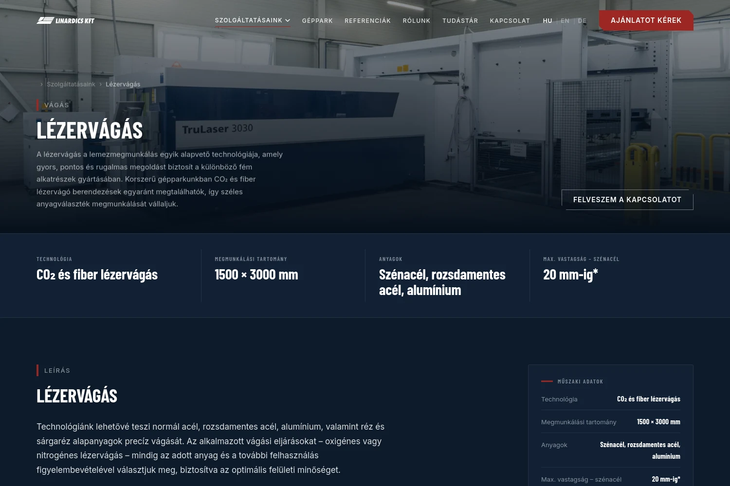
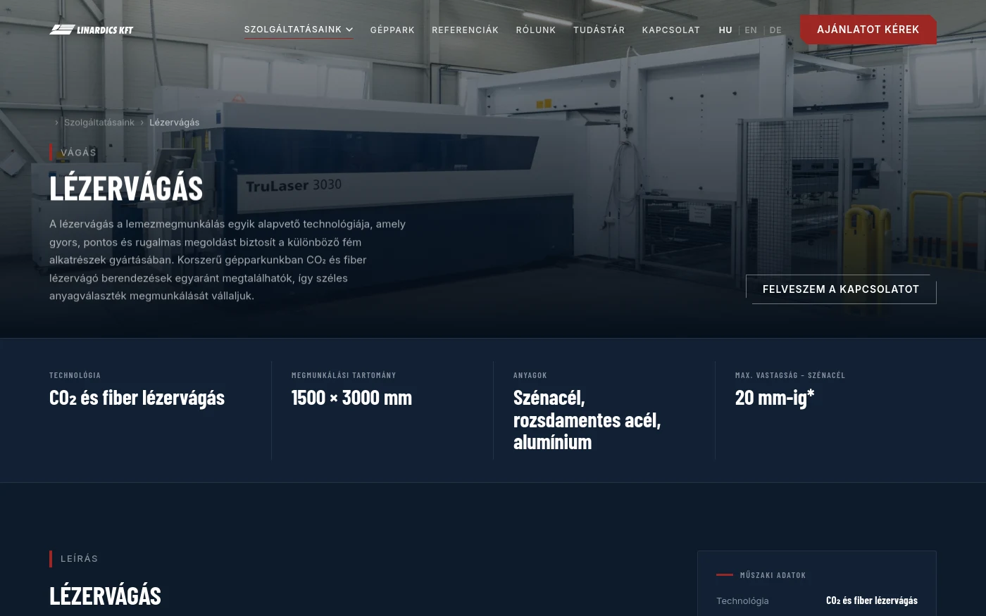
Service pages
Five groups, fifteen sub-pages. Each opens with its own technical data: technology, working range, materials, maximum thickness.
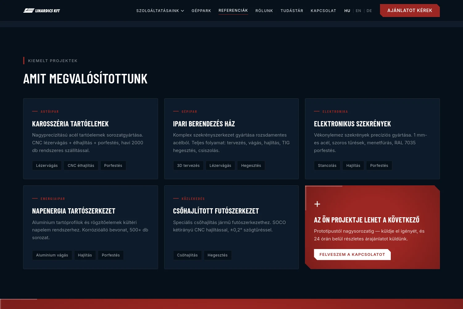
References by industry
Automotive, machinery, electronics, energy, transport — each project with the technologies used and the batch size.
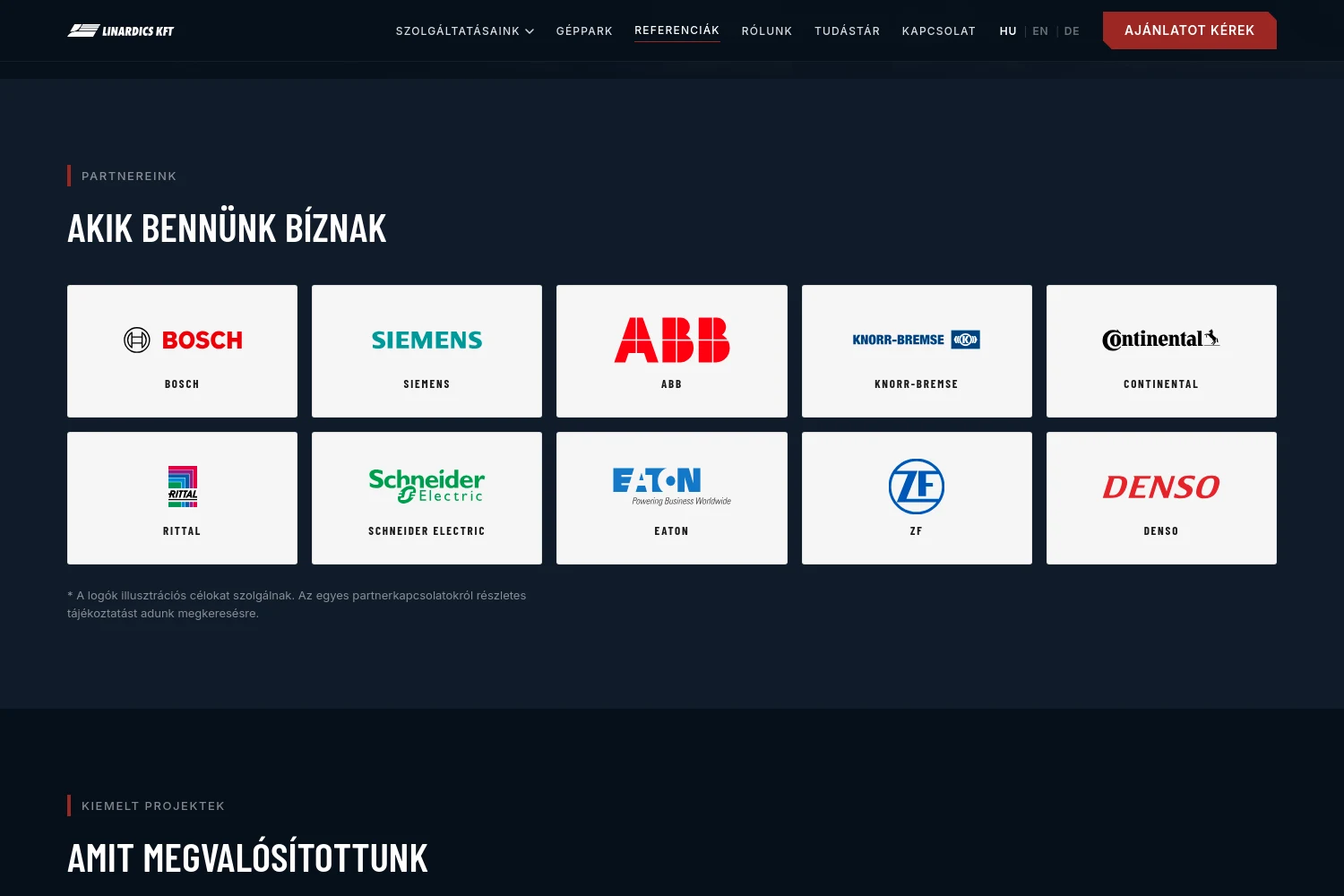
Signals of trust
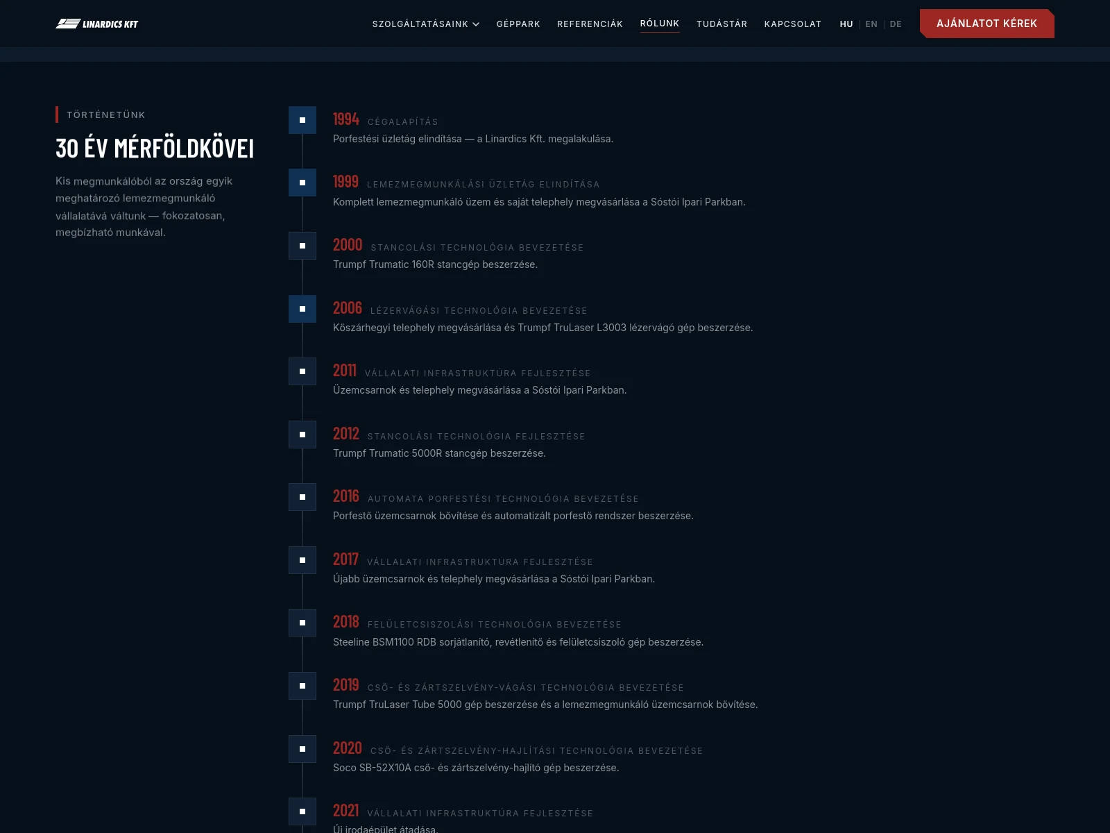
Partner logos, ISO 9001 and ISO 3834-2 certification, a thirty year manufacturing timeline — the trust side of the decision gets its evidence too.
Knowledge base
Material guides and technology comparisons in article form — for the searches buyers run before they decide.
Three languages, one skeleton
Hungarian, English and German from the same content skeleton, with per-language routes, hreflang, and a separate downloadable certificate for each language.

The hard part was never the look — it was the structure. How do eighteen machines, fifteen services and three languages connect so that adding one new machine is not a developer task?
Tamás Biró
lead developer, KUTASSY