AluConnect
We had to show the product's range and its premium feel — while barely a handful of them existed in the country, and those sat in a showroom.
aluconnect.hu →AluConnect is a hybrid aluminium-PVC window system: the construction is developed and manufactured by Aluveka Group, and brought to the Hungarian market by Prémium Fenster System Kft. as the exclusive processor. A new product with an unknown name.
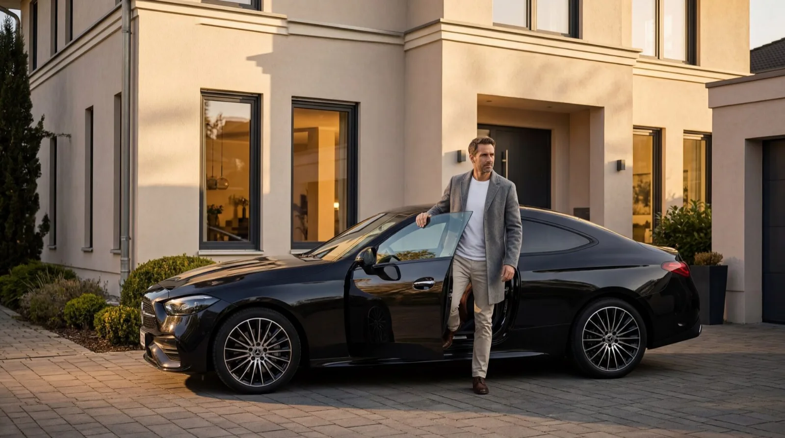
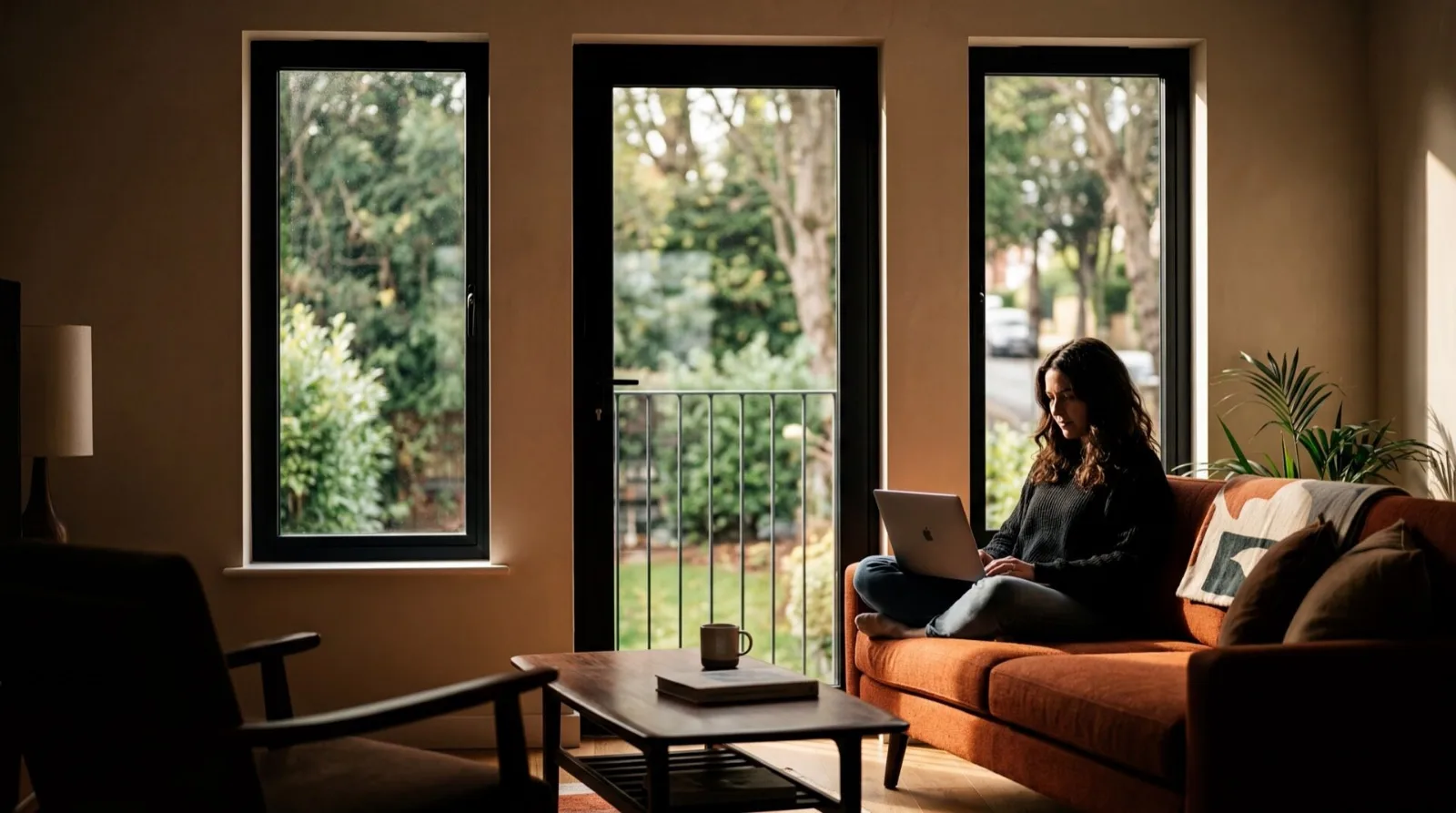
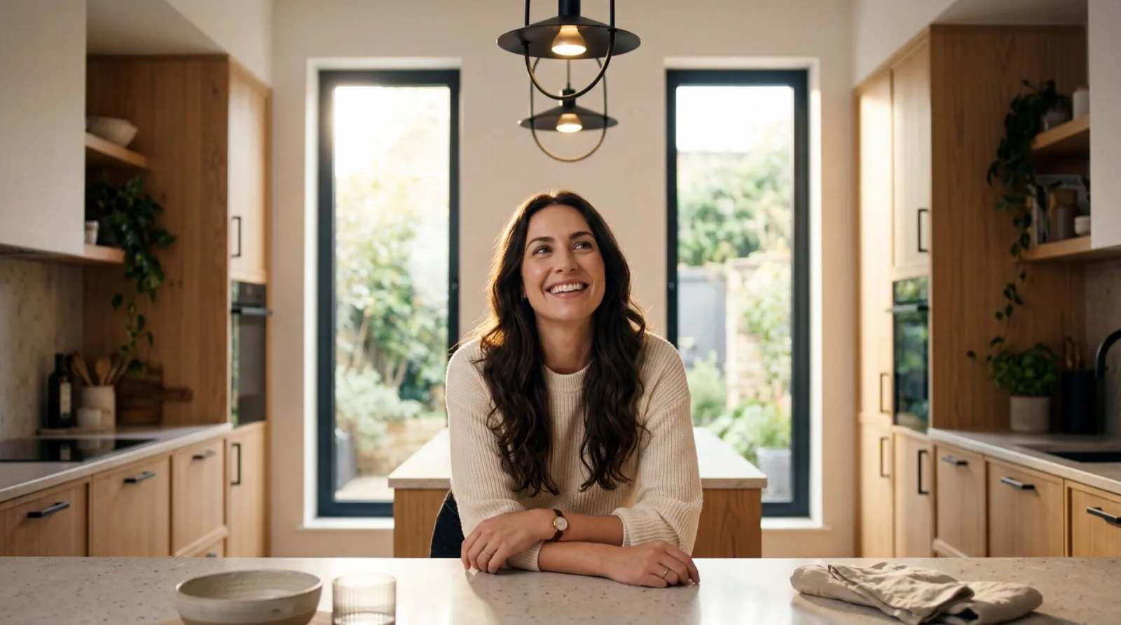
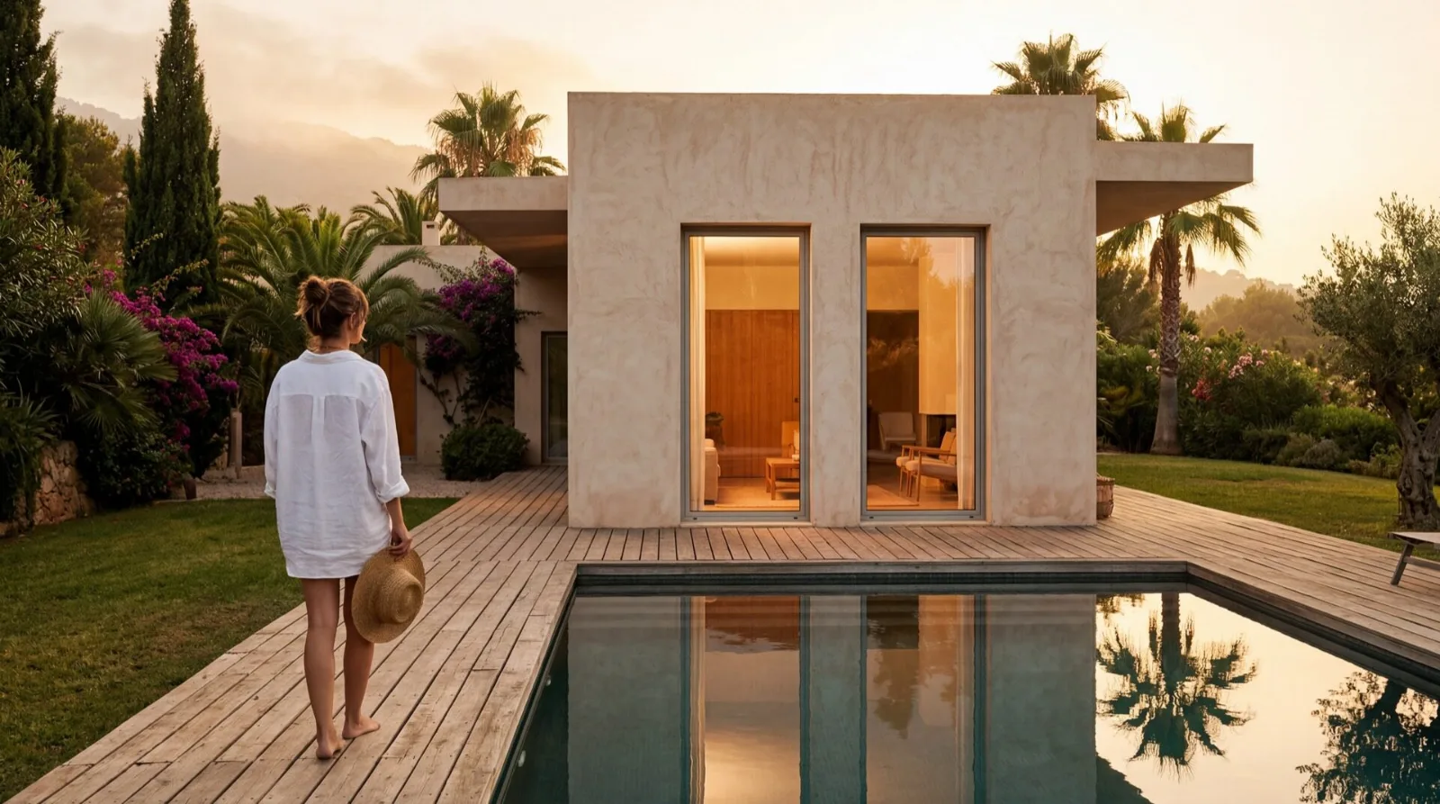
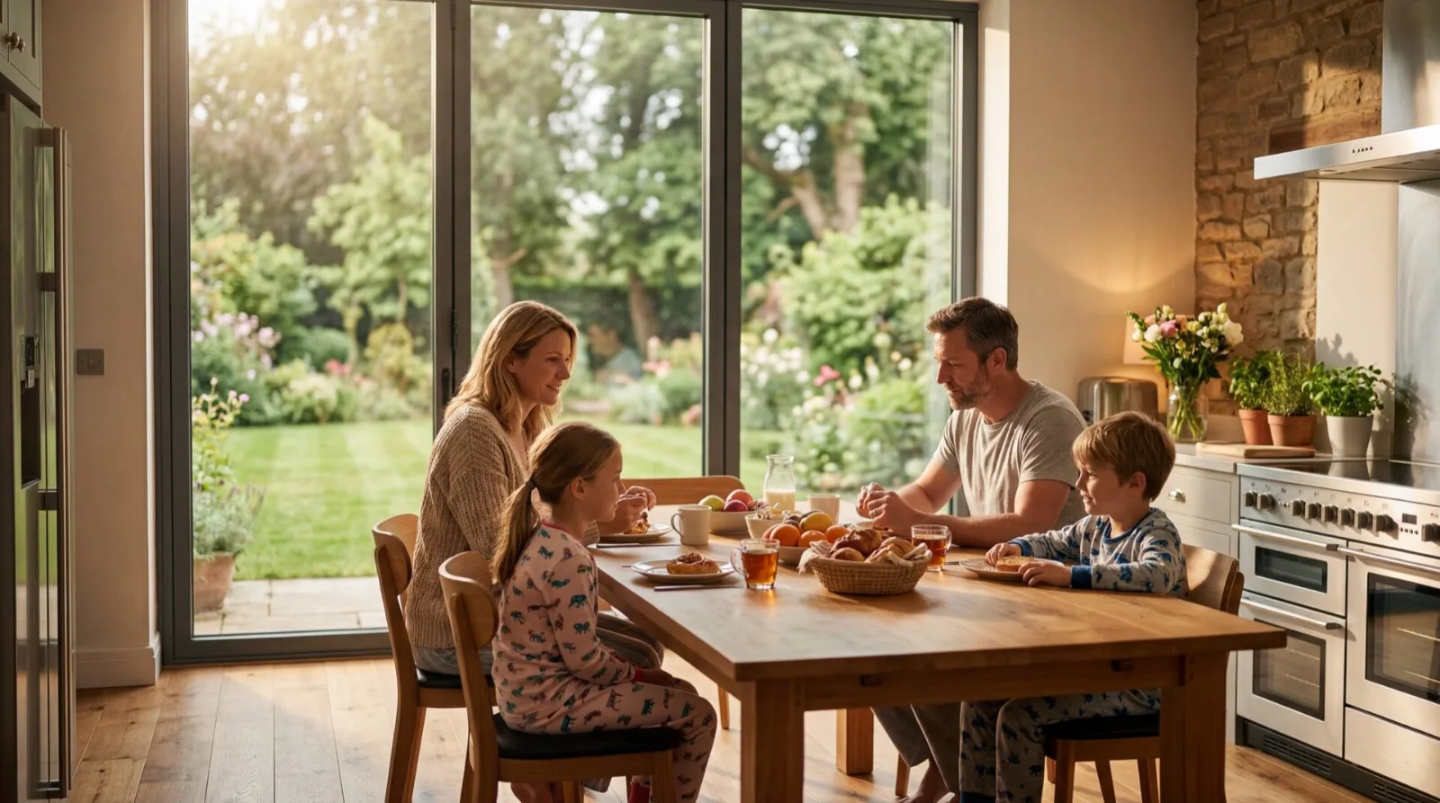
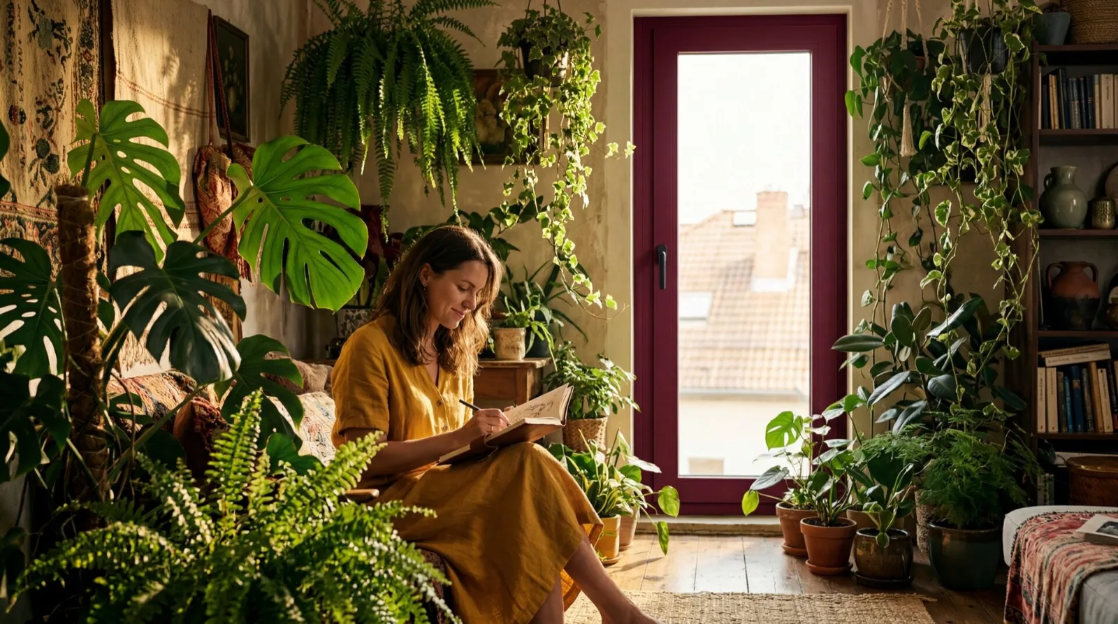
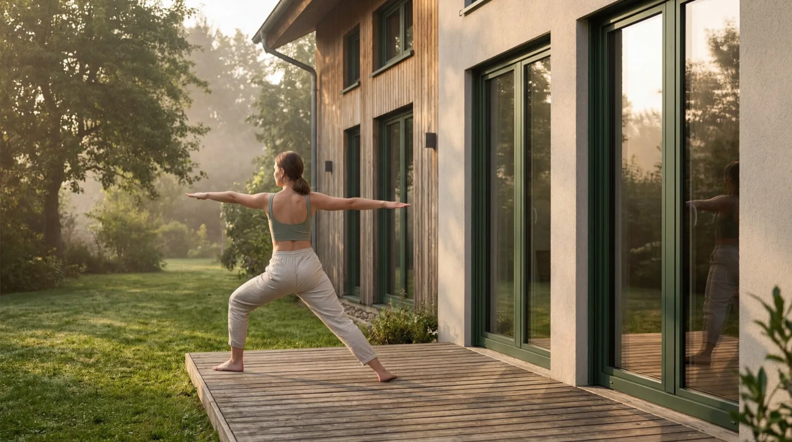
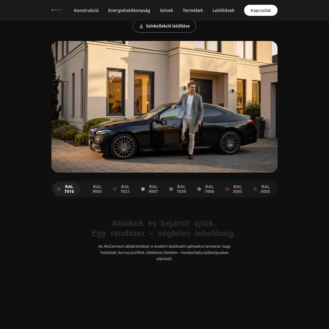
The thesis was simple: show the range and show the premium feel. That gave us the solution too — present the different window types, in different colours, in different life situations. Not in a catalogue, but in homes.
There was one problem with it. At the time barely a handful of finished units existed in the country, and those were in a showroom, so photographing them in houses was not possible. From the manufacturer we only had a few 3D models supplied for production — which meant the entire visual world had to be built.
The research told us who the buyer personas were, what they look for and what they expect from a site like this: an Apple-like experience. So the real challenge was not producing the creative itself but the balance — the technical and the aesthetic layer serving the dealer and the homeowner at the same time.
There was nothing to replace.
This was a product launch, not a redesign. There was no previous website to rework and no identity to align with. That gives more freedom — and more responsibility: there is nothing to measure against to tell whether you are heading the right way.
What we had: the manufacturer's technical documentation and a few 3D models supplied for production. There were no photographs, and there could not be — the handful of finished units stood in a showroom, not in homes.
That pushed the centre of gravity of the project onto creative and visual direction. There was nothing to curate; we had to decide what world this product lives in — and then build that world.
The construction as the content
The site is a single scrollable product page with five sub-pages: downloads, contact and the three legal pages. The order is the order of persuasion — benefit, construction, energy efficiency, colour, product range, sustainability, contact.
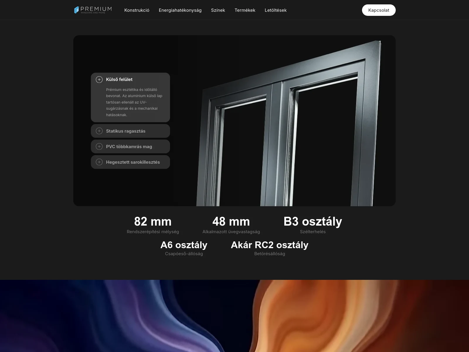
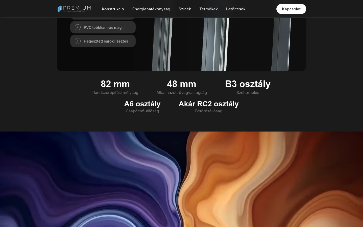
At its centre sits the interactive construction diagram: four layers — outer face, structural bonding, multi-chamber PVC core, welded corner joint — opened one at a time next to an exploded 3D render. Below it are the figures a dealer looks for: 82 mm system depth, 48 mm glazing, wind load B3, driving rain A6, burglary resistance up to RC2.
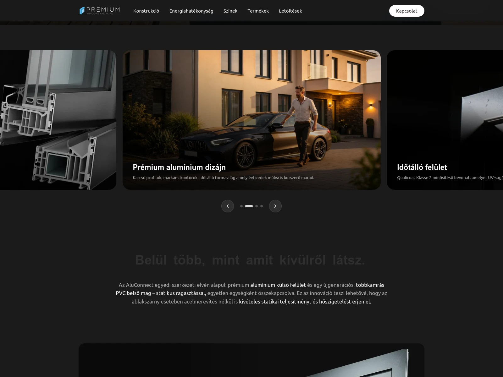
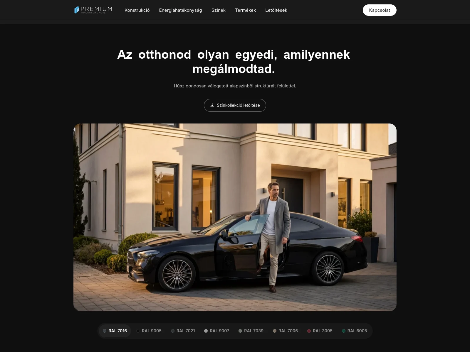
We did not curate the visual world — we built it.
Creative direction started from the research: we knew who the buyer personas were, what they look for, and what they expect from a site like this. The answer was unambiguous — an Apple-like experience. That set the bar; everything else followed from it.
Range cannot be claimed with one beautiful house. So the scenes were built at the intersections of three axes: life situation, colour and window type. The same product in a different home, a different RAL code, a different opening mode — that is how range becomes something you see rather than something you are promised.
The palette is a near-black base with a single light blue accent. A window is metal and glass: both live on reflection, and both read on a dark background where they would dissolve on a light one. One typeface, Inter, structured by weight — on a page where a measured figure and a marketing sentence alternate in the same flow, switching families would only get in the way.
And motion is not decoration. The premium feel is assembled out of the timing of details: the scroll-triggered movement, the way the diagram layers open, the rhythm of the image transitions. It is the layer nobody notices on its own — they just feel that the whole thing is considered.
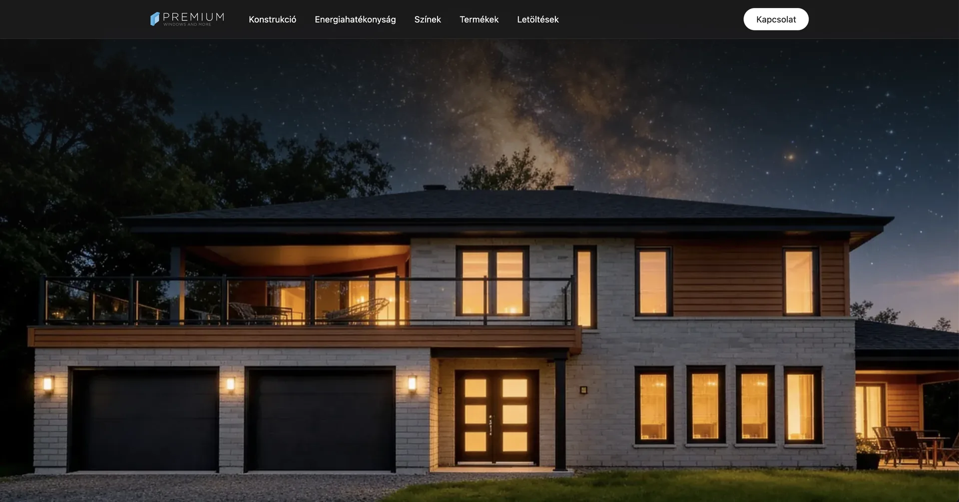
We could not go out and shoot, because there was nowhere to shoot — a handful of units existed in the country, and those in a showroom. At first that looked like a constraint; then it turned out to be freedom. We designed every single frame. The colour, the house, the time of day were all decisions, not accidents.
Bálint Kutassy client lead and spokesperson for the team, KUTASSY
- Base #1B1B1C Page background
- Deep #0F0F0F Section contrast
- Accent #28A8E0 Emphasis, icons
- Text #FFFFFF Headings, figures
- Inter Headings, body copy and figures — all in one family
What we built, and what it was based on.
With an unknown product the site's first job is not to sell but to make people understand. Every decision below carries its source.
-
01
The identity was finished before the site.
Without a logo, a palette and a typeface, the website would have been just a design proposal that the next deliverable overrides. Once the identity was fixed, the catalogue, the colour collection and the site all came out of the same system.
Based on: in a product launch the website is only one channel among many — if the identity arrives afterwards, everything gets redrawn.
-
02
The construction became a diagram, not a paragraph.
Four layers, each opening its own explanation next to the exploded render. Visitors move at their own pace and read only what concerns them — the dealer the bonding, the homeowner the outer face.
Based on: the advantage of the hybrid construction is four separate technical claims. Crammed into one paragraph, none of them lands.
-
03
The imagery is 3D because there was no other way.
At the time barely a handful of finished AluConnect units existed in the country, and those were in a showroom — so photographing them in homes was out of the question. From the manufacturer we only received a few 3D models built for production. The entire visual world grew from those, from the lifestyle scenes to the exploded construction render.
Based on: it was not an aesthetic decision, it was the only route available. In return every frame is designed — the colour, the house and the time of day included.
-
04
The images came out of a matrix.
Life situation, colour and window type: the scenes were built at the intersections of those three axes. Not one beautiful house from several angles, but the same product in a different home, a different RAL code, a different opening mode.
Based on: range is only a claim if you can see it. One type in one colour is not range, it is a product shot.
-
05
Two personas, one scroll.
The research showed us who decides. The dealer wants figures — Uf value, system depth, RC2 — while the homeowner wants the look and the reassurance. The real challenge was not serving one or the other but the balance: the same scroll has to carry both. Hence the alternation of scene, data strip and explanation.
Based on: both readers walk the same page but do not read the same things. Uf = 0.8 W/(m²K) therefore sits on the first screen, while its justification gets a section of its own.
-
06
Motion is not decoration; it carries the premium feel.
The research said the audience expects an Apple-like experience from a site like this. Still images cannot deliver that: the scroll-triggered movement, the way the diagram layers open and the rhythm of the image transitions together produce what a visitor reads as "premium".
Based on: the premium feel is assembled out of the timing of details. If the motion lags or jumps, that reflects back onto the product.
-
07
Downloading is a goal, not a by-product.
The catalogue and the colour collection get their own page with a direct download. For a dealer that is the most frequent task on the site: to take away something they can show a customer.
Based on: on a B2B2C product site the download often happens before the enquiry — and frequently leads to it.
-
08
A single HTML document, with its styles and script inside it.
A product page is not an application: no database, no search, no login. We built a static output with the styles and the script compiled into the document, so there is no separate request for the rendering to wait on.
Based on: an LCP of 1.2 s and zero layout shift, measured. A heavier framework can reach the same — it just takes more work.
How it was made
The five layers the site is built from.
One sentence for the point
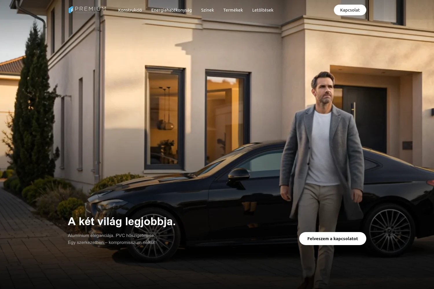
"The best of both worlds." The elegance of aluminium and the insulation of PVC in one construction — the whole positioning on the first screen.
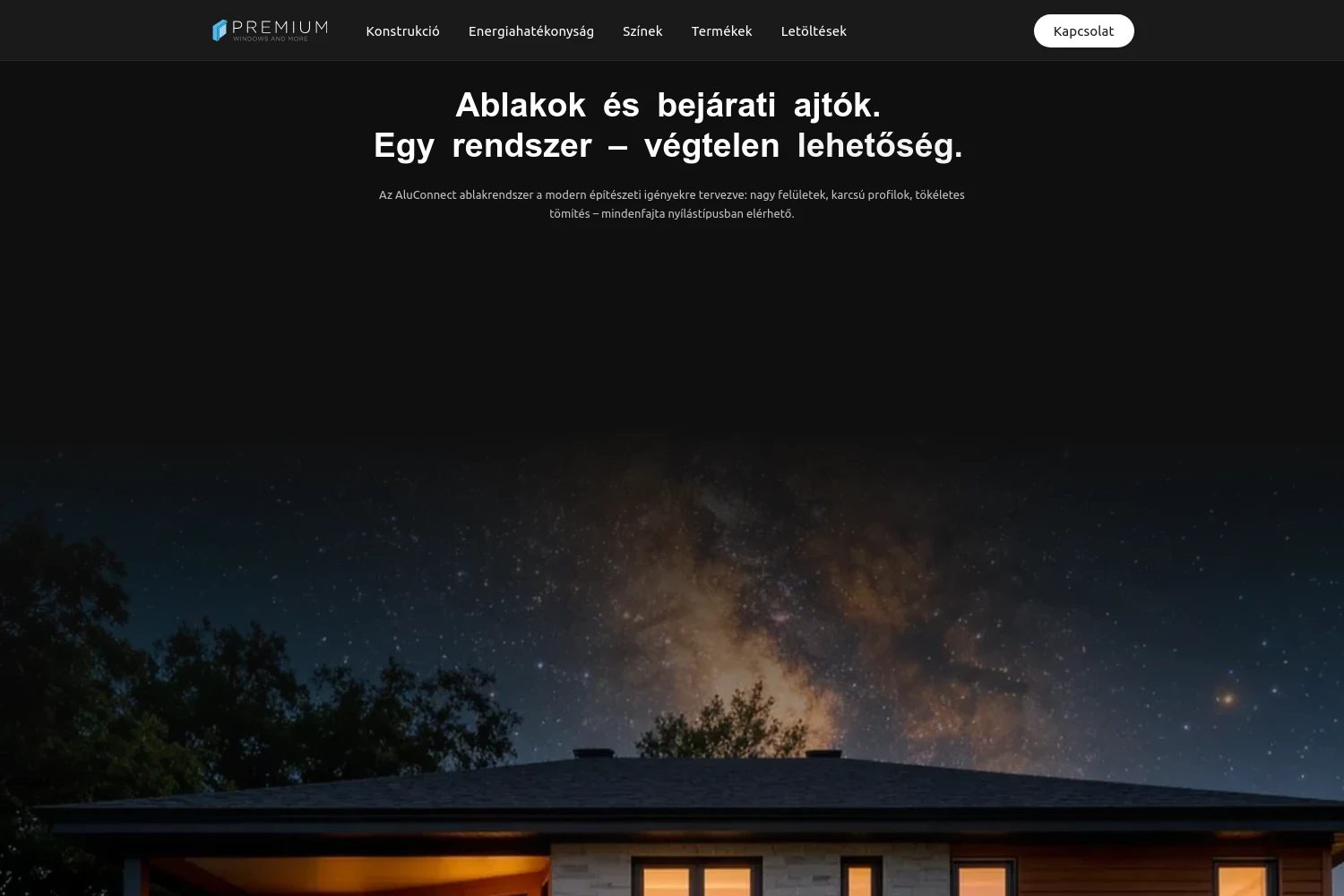
Product range
Windows and entrance doors from a single system — casement, tilt-and-turn, sliding, slim profiles, varied divisions.
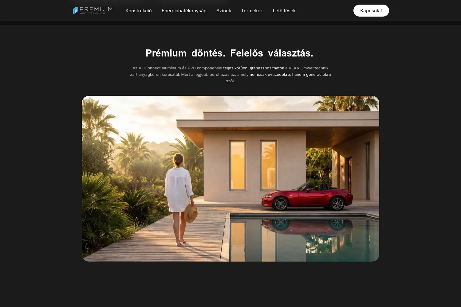
A responsible choice
Full recycling of both PVC and aluminium in a closed material loop — an argument to put beside the premium decision for environmentally minded clients.
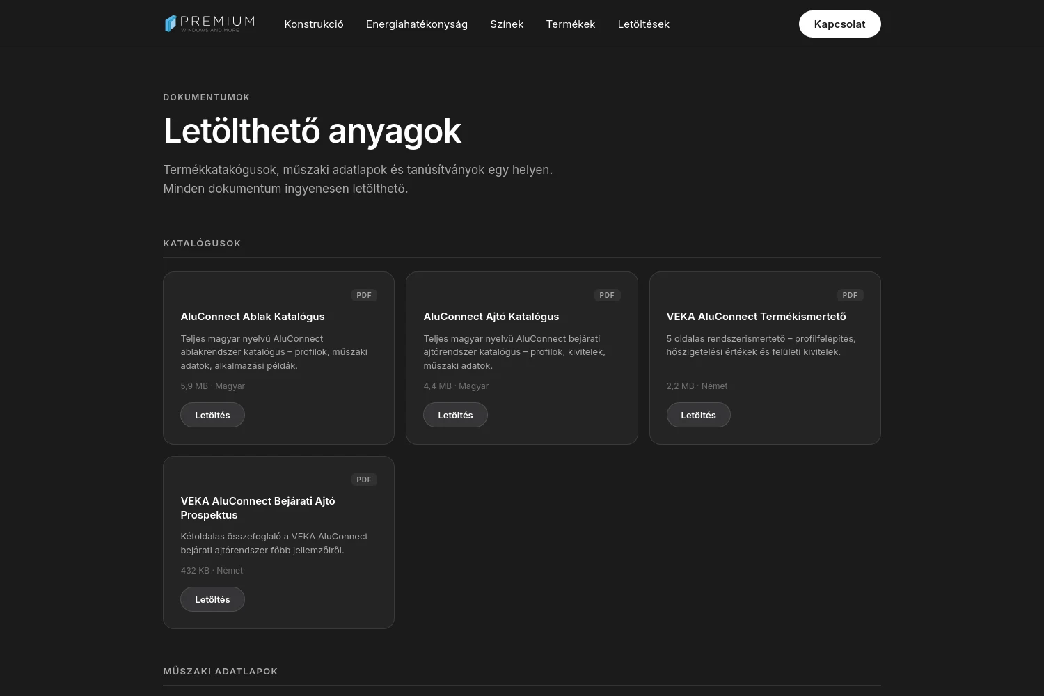
Downloads
Catalogue and colour collection one click away — this is what a dealer takes to their customer.
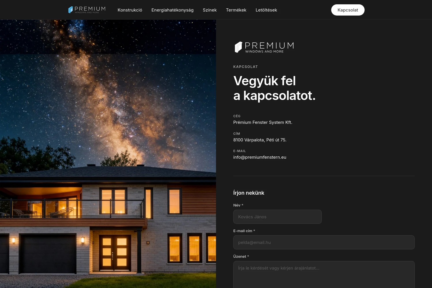
Getting in touch
Separate paths for dealers and installers — the question is settled before the form, not after it.

The diagram is the point where a product page either works or does not. Four layers had to become openable while the render moved with them — and all of it on a site with no framework underneath.
Tamás Biró
lead developer, KUTASSY